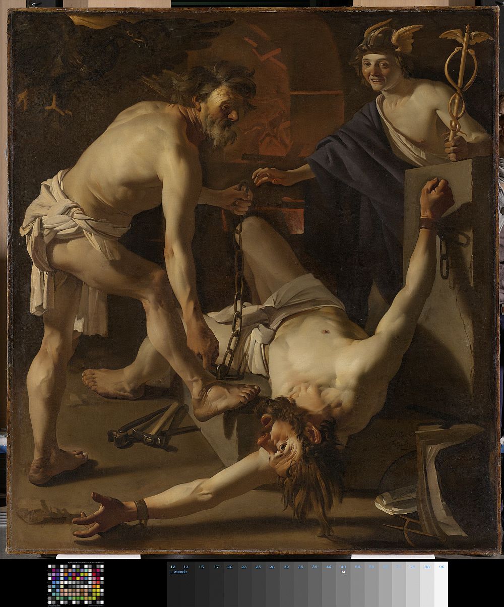
Dirk van Baburen:
Prometheus Chained by Vulcan, 1623,
Rijksmuseum Amsterdam
Mich interessierte, was passiert, wenn man meine Methode mit den mehrteiligen Bildflächen auf ein Gemälde überträgt, das ganz traditionell geplant war. Immerhin fehlten nun 40% der Bildfläche.
Ich überprüfte das an verschiedenen Beispielen, die ich hier gerne vorstellen möchte, und das Ergebnis war bei dem vorliegenden Gemälde war recht überraschend.
Diese Gemälde war für mich nicht gerade Liebe auf den ersten Blick, denn die Farbpalette ist recht schmal. Aber es ist sicherlich ein eindrucksvolles Barockbild in seiner Dramatik und Perspektive. Es erzählt die Geschichte von Prometheus, der den Menschen das Feuer brachte und dafür von den Göttern gestraft wird. Er wird an einen Felsen, nicht in de Schmiede des Vulkan, und jeden Morgen wird ihm ein Adler, links oben im Bild, die über Nacht nachgewachsene Leber herauspicken. Es ist eine der zahllosen Geschichte von endlosen Qualen, die die Mythologie hergibt. Hermes (Merkur bei den Römern) schaut mit Vorfreude zu, wie der Wille der Götter umgesetzt wird.) Eigentlich sieht er eher aus wie ein Kind, das noch nicht begriffen hat, wie grausam sein Spiel ist, aber damals war die Sicht noch eine andere.
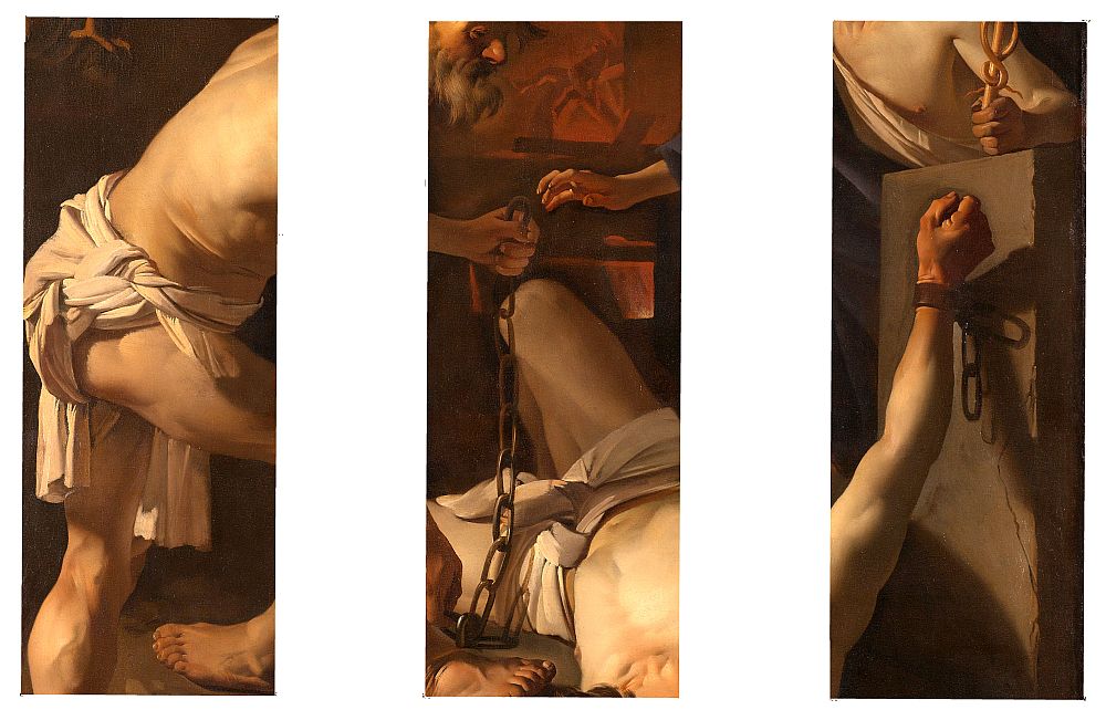
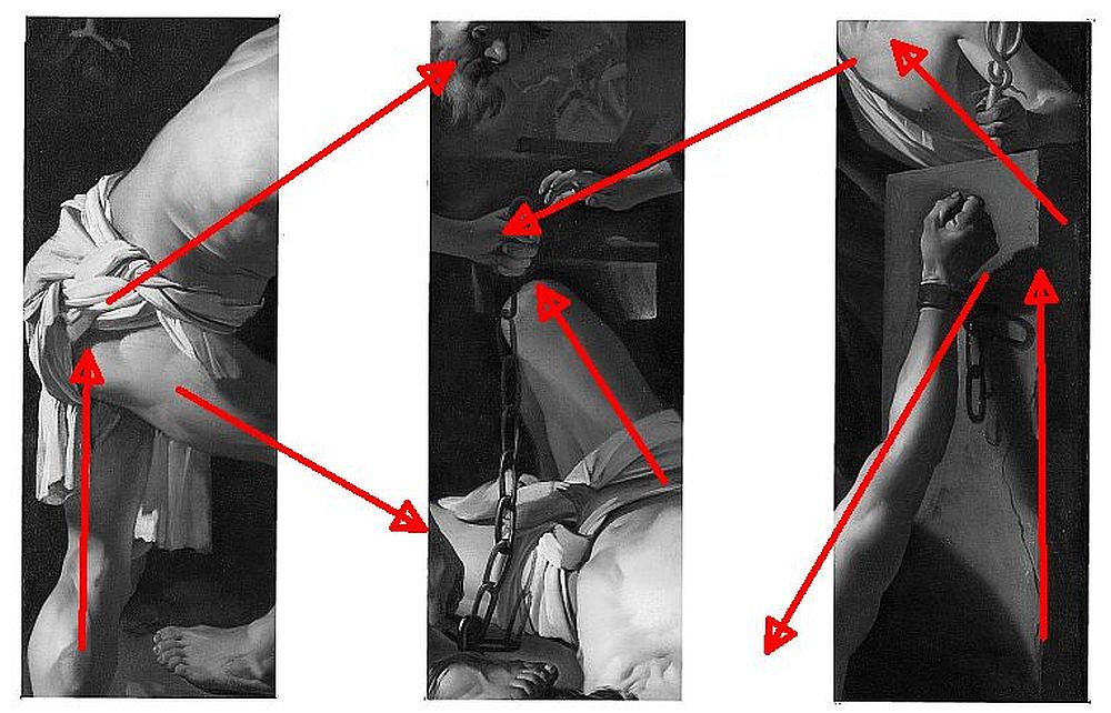
Schaut man nun durch „die Brille“ meiner dreigeteilten Bildfläche, so ergibt sich ein bewussterer Blick auf einzelne Elemente des Bildes. Beachtet man nun die Achsen und Konturen genauer, so kann man erkennen, wie van Baburen die zeichnerische Seite der Komposition angelegt hat.
Der Stein rechts und das Standbein des Vulkan links rahmen die Handlung seitlich ein, die Diagonalen festigen dies Klammer um das Hauptgeschehen, die Ankettung. Der Arm des Hermes und des Vulkan verbinden die Bildseiten und weisen auf die Kette hin, der Oberschenkel des Prometheus betont das zusätzlich.
Auch der rechte Oberschenkel des Vulkan verlängert sich in die Körperform des Prometheus hinein. Die vielen Diagonalen sind das klassische Kompositionsmittel, das der Barock zur Dramatisierung neben dem Hell-Dunkel der Farben einsetzt.
So hat das Auge nun mehr Ruhe, um sich auf Teilaspekte zu konzentrieren, ohne die das Bild nicht die Qualität hätte, die wir hier wahrnehmen. Überhaupt: Wahrnehmung ist auch hier im Bild mein Lieblingsthema. Wie unser Blick gelenkt wird und wie wir auf Informationen reagieren, um und ein „Ganzes“ vorzustellen, kann man hier wieder schön sehen.
Viele Spaß mit der Kunst und dem Bild, das das Rijksmuseum freundlicherweise zur Verfügung gestellt hat.
I was interested in what a rather rigid reduction of the traditional painting would do with it. “Cutting off” 40% off an old master seemed a grave loss of painting but I wanted to know what effect it would have on our perception.
This painting of Prometheus was not love at first sight when I saw it for the first time. But there is certainly no question about the quality of this masterpiece looking at the perspektive and the ongiong action in the painting.
It illustrates the story how poor Prometheus is put in chains and tied to the ground for bringing fire to mankind, the same Vulcanos uses for his smithy to prepare the villain for his punishment. Full of expectance Mercury smiles and seems satisfied that the Gods have their will, though his face looks more like one of a young boy not fully aware of the cruelty of the plan. The spectator sees the eagle in the background and in his mind the story gets completed. The narrative works.
Have a look at the muscles the painter carefully describes, at how the pose of the persons describes activity and feelings of the persons involved. How the painter has mastered perspective can be especially seen in the way the protagonist is view from the head downward along the axis of his body, a masterpiece of drawing indeed.
Anyway, I am a painter and tend to react to colours and this painting consists mainly of the same scale of various shades and tints of brown we get in numerous other baroque paintings.
But I was curious and applied the method I have been using now for about 20 years: separating sections of the painting or drawing I am working on different panels set apart at a certain distance. The gap now leaves out part what we would see in reality and the mind makes up for the loss. Here is the part that I have been looking into.
The result of this method: The reduction underlines the main forms and directions in the painting, how they add to the central theme Chaining Prometheus, but also connecting areas and leading the eye to and fro past the different zones in the composition, aspects the visitor will probably no see as clearly as he will be distracted by the narrative and the way it is displayed.
For over 20 years I have been using the method of presenting images in multi panel form. As a painter myself I usually invent motives and structures. They offer “input” to eyes and minds of the spectators. That way I try to understand how our perception works, what it does with the information left and what might be relevant structures for a satisfactory experience as a spectator. Finally this might show aspects of how we understand the world: What our mind gets is fake, it is made up, but somehow it works.
Enjoy, and thanks to the Riksmuseum for providing the digital image.